Evaluating Your Customer Relations

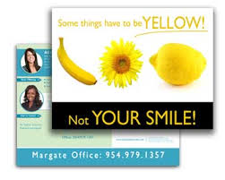
There is a lot that goes into maintaining positive customer relations. one-time customers can turn into loyal customers if the right attention is paid to them. Make your customers feel valued and appreciated, and they will be hard-pressed to go anywhere else.

Here are a few questions to ask as you evaluate the relationships you have with your customers:

  • How would you describe one of your typical customers?
  • If you saw a regular customer at the mall, would you recognize him or know his name?
  • Do you request customer feedback and take their comments into consideration?
  • Do you organize your business schedule around the convenience of your customers?
  • Do your customers keep coming back?

If you have satisfactory answers to these questions, congratulations! If you were unsure of how to answer, it is time to brush up on your customer skills.

http://www.ParagonPress.net – #1 in Shreveport, LA for printing, direct mail, graphic design, marketing – 318.868.3351

POSTCARDS – Simple Yet Effective Marketing

ostcard marketing remains one of the most cost-effective means of getting your name and message in front of prospective buyers. With a postcard, you can target your message to only those customers and prospects who are most likely to want your services.

See full size image

Postcards can come in a variety of sizes. Standard-sized postcards offer just the right amount of space for your message. Jumbo postcards are an effective way to spread your message because they stand out, get attention, and offer more space for your important messages.

Here are some more great reasons why postcards should be included in your marketing plan:

  • Postcards are CONVENIENT. Your message is right in front of your customers. They can read your offer and find out about a sale without having to open an envelope. in addition, they are able to refer back to your postcard at any time, and save it for future reference.
  • They’re INEXPENSIVE. Printing costs for postcards are small, considering the large impact they can have on buyers.
  • They’re EASY TO TEST. Because they’re so inexpensive, postcards are a great medium for testing the effectiveness of your messaging. Start by sending postcards to a small sampling of your mailing list. When you’re satisfied with the results, have more printed and spread out from there.
  • They’re EASY TO TRACK. Especially if you include a coupon or special offer on the card.
  • They make a LASTING IMPRESSION. How many TV or newspaper ads do you remember after just one viewing? The reason we forget most conventional ads is because they’re a distraction, not the main focus of our attention. A jumbo postcard has staying power. It leaves a more lasting impression because of its size, its content (especially if it includes a coupon or special offer), and its simplicity.

See full size image

Contact us today about printing postcards for your company!

http://www.ParagonPress.net – #1 in Shreveport, LA for printing, direct mail, graphic design, marketing services – 318.868.3351

SMART Advertising

Advertising is vital for the health of all businesses – but how can you tell if the advertising method you are using is working?

Here are some easy ways to test your ads:

  • Advertise just one item in an ad, but don’t display the item at your business for a set amount of time. Then count the calls that come in for that item. If customers can’t see the item on display, they will be less likely to ask about it, so you will be able to tell how many sales have resulted fro your ad.
  • Run the same ad with a different-colored coupon in 2 different publications. Ask customers to bring in the coupon to redeem the savings. This will let you know which publication reached the right audience and is worth your advertising dollars.
  • Switch advertising mediums and watch any change in sales.
  • Ask new customer how they heard about your business, and use this information to make future advertising decisions.

http://www.ParagonPress.net – #1 in Shreveport, LA for printing, direct mail, graphic design, marketing services – 318.868.3351

Room to Breathe

One of the most common pitfalls in design occurs when text is squeezed into borders and boxes, or wrapped too tightly around illustrations or silhouetted photographs. Next time you are faced with the challenge of creating sufficient breathing room in your designs, remember: there is beauty in simplicity.
Compare the following examples of crowded vs. comfortable designs:
Here are some simple solutions on how to avoid the claustrophobic, unappealing feel of crowded design:
  • Increase the size of the border or box.
  • Increase the size of the margins on the edges of the page.
  • Add more breathing room around individual elements by increasing the white space in text wraps.
  • Decrease the font size, or cut back on text when possible.

http://www.ParagonPress.net – #1 in Shreveport, LA for printing, direct mail, graphic design, marketing services – 318.868.3351

Low Cost Clip Art & Image

Digital clip art collections provide a great source for designers to obtain inexpensive (sometimes even royalty-free) images. If you’re considering purchasing a digital clip art collection, here are some questions to ask:
  • Are the images in this collection compatible with my operating system and the software I use?
  • Is the file format (EPS, JPEG, TIFF, GIF, etc.) versatile enough for my needs?
  • Are the images of a high-enough resolution and quality?
  • Are the images bitmapped or vector-based? (Vector-based images are better if you’ll need to enlarge them.)
Other Sources to Check
As you search for images, don’t forget to check the Library of Congress web site. In addition to copyrighted images, their online catalog of prints and photographs even includes a number of quality images in the public domain, as well.
Old magazines and books are another potential source for images. Any that were published before 1923 are in the public domain. Those published between 1923 and 1963 might be in the public domain, unless the copyright holder renewed their claim. Anything published after 1963 is still under copyright, so you’ll need to obtain permission before using it.
And finally, our print shop has a number of print-quality clip art collections on file, too, which you are free to browse.

http://www.ParagonPress.net – #1 in Shreveport, LA for printing, direct mail, graphic design, marketing – 318.868.3351

Liquified Lettering

Type effects are a good way to turn a headline into a visual element. One popular type trend, known as liquid or “aqua” lettering, is easy to reproduce in Photoshop using the steps below:
  1. Create a 300dpi image in Photoshop, with dimensions that are large enough to fit your entire headline text.
  2. Set the foreground color to R=0 G=51 B=222. This will provide the color for your text.
  3. Select the type tool and choose a serif font, such as Garamond or Times New Roman.
  4. Set the font size at 72px, and type the text you want to use in the headline.
  5. Control-click (Mac: Command-click) inside the type layer to select the shape of the letters.
  6. Reduce the selection by seven pixels, by choosing Modify > Contract from the Select menu at the top of the screen.
  7. Create a new layer (with your selection still in place), and change the foreground color to R=31 G=82 B=255.
  8. Using the fill tool, color your selected area with this new color.
  9. Once that’s set, deselect the selected area, and duplicate the layer you just created, so you now have two copies of it.
  10. Name the first of these layers “Color1” and the second “Color2.”
With all your layers in place, you’ll now need to make the following adjustments:
Color1 — Set the Blend Mode to Multiply

  • Double-click the “Color1” layer on the layers palette to bring up the Layer Style dialog box.
  • Set the Blend Mode to Multiply, and hit OK.

Color2 — Add a Gaussian Blur
  • Highlight “Color2” on the layers palette, and choose Blur > Gaussian Blur from the Filter menu at the top of the screen.
  • A dialog box will appear. Set the radius to 5px and hit OK.
Color2 — Add an Emboss Effect
  • Double-click the “Color2” layer on the layers palette to bring up the Layer Style dialog box.
  • Highlight and select the Bevel and Emboss style.
  • For the Style setting, choose Emboss.
  • Change the Depth to 441% and the Size to 10px.
  • Set the Highlight Mode to Normal, with an Opacity of 100%, and the Shadow Mode to Color Dodge, with an opacity of 40%.
  • Press OK to continue.
Color2 — Adjust the Curves
  • With the “Color2” layer still highlighted on the layers palette, choose Adjustments > Curves from the Image menu at the top of the screen.
  • Another dialog box will appear.
  • Insert stop points at the following coordinates (input/output): 50/160, 200/90, and 233/180.
  • Once you have these coordinates in place, click OK.
  • Text Layer — Add a Drop Shadow
  • Right-click (Mac: Option-click) on the text layer in the layers palette.
  • Select Blending Options from the dropdown menu that appears.
  • Highlight and select Drop Shadow in the Layer Style dialog box.
  • Set the color (the swatch next to Blend Mode) to R=0 G=32 B=186 and the Opacity to 75%.
  • Choose a Distance of 5px, a Spread of 0%, and a Size of 9px.
The effect is now complete.

http://www.ParagonPress.net – #1 in Shreveport, LA for printing, graphic design, direct mail, marketing – 318.868.3351

Painting with Light

Adding Dramatic Lighting Effects to Your Photo
With a bit of selective lightening and darkening in Photoshop, you can make a dull, lifeless photograph pop off the page.
There is nothing wrong with the original image, although the “before” picture lacks the dramatic mood that the change of lighting adds to the “after” picture. By using Photoshop to accentuate the darks and the lights, the viewer’s attention is now focused directly on the couple.
Here’s how to do it:
  • First, add a new layer and fill it with 50% gray with 100% opacity.
  • Change the layer’s Blending Mode to Color Burn, which will darken the image and make it look over-saturated.
  • Then decrease the layer’s opacity to your taste. (Opacity in the range of 50% to 80% usually works well.)
  • To create the ray of light, use a large, soft-edged, white airbrush at 2%–3% opacity and paint on the gray Color Burn layer to create a new light source.

http://www.ParagonPress.net – #1 in Shreveport, LA for printing, direct mail, graphic design, marketing – 318.868.3351

What is a Creative Solution?

The Creative Process
Graphic design brings together two different things: artistic creation and the practical world of commerce. Put simply, it is intelligence made visual. A designer is a creative artist who deals with the realities of planning, from assessing client needs and crafting a solution to selecting appropriate materials (papers, inks, glues, and varnishes), maintaining strict budgets, and understanding visual communication.
Creative Solutions
A designer must make connections in the mind between creativity and process in order to successfully communicate a message to an audience and answer a client’s needs.
What Is a Creative Solution?
At its core, a creative solution solves a client’s problem through the design medium/language. It is…
  • appropriate for the client’s product, spirit, and objectives.
  • communicated clearly.
  • functional. A package has to open. A pictogram has to identify. A map has to direct.
  • impactful.
  • memorable.
  • original.
  • fresh, stimulating, exciting, and stunning.
  • executed appropriately and well.

http://www.ParagonPress.net – #1 in Shreveport, LA for printing, direct mail, graphic design, marketing – 318.868.3351

Eye-Teasing Design

When working in graphic design, making things look good may seem like the right thing to do, but perhaps making things attract attention should be your goal. Attracting attention can often be done by creating tension in the eyes of the viewers. Tension is defined as balanced relation between strongly opposing elements, or the interplay of conflicting elements. This tension or conflict will cause viewers to stop and take a closer look at your design in hopes of uncovering what is making them subconsciously uncomfortable. Here are a few tension creating tips to intrigue your viewers:
  • Barely touching elements tease the viewers. Their eyes are drawn to this point of almost intersection, and they keep checking to see if the items really touch.
  • Design decisions that appear tentative, such as elements that are off-kilter, can cause conflict because the viewer will naturally want things to be straight and orderly. Deliberately placing images off balance, as long as it isn’t overdone, can help capture a viewer’s attention.
  • Using complementary colors next to each other, especially when there is a shared edge, can cause a vibration in your design. This is because each color is vying for dominance in the eyes of your viewer. Choose your colors to attract attention.
Using these techniques at some of the focal points of your piece, such as the center, and the corners, will retain the viewer’s interest as they digest all that your piece has to say.

http://www.ParagonPress.net – #1 in Shreveport, LA for printing, direct mail, graphic design, marketing – 318.868.3351

Secret to Good Forms

There are those who are bored to tears by the thought of designing a form and those who love the fussy challenge of creating a good, clear, usable document. Forms are seriously underrated in the world of graphic design.
Of the four basic design principles (contrast, repetition, alignment, and proximity), the secret to a good-looking form is alignment. Lack of alignment is the single biggest failure that makes a form appear unclear to the user. The other principles are also very important, as in any design, particularly contrast to help direct the user through the form, proximity to keep groups of related pieces of information together, and repetition to tie it all together. But alignment is the key.
The top example uses interesting typefaces and calls out the major features in bold for clarity in communication and visual contrast and repetition, but it doesn’t look as clean and clear as it could.
In the lower example, elements are aligned, which naturally presents a cleaner look. Cleaner (usually) communicates better. Also, the spacing was adjusted so that the elements that belong together (like those two lines of “suggested donations”) are closer together, and the separate elements have a wee bit of extra space between them (following the principle of proximity).

http://www.ParagonPress.net – #1 in Shreveport, LA for printing, direct mail, graphic design, marketing – 318.868.3351