Category Archives: graphic design

Revive Your Old Manuals

While manuals can serve as one of the single most important sources of company information, they may also be one that is most frequently overlooked.


Why do most manuals lack readership? Simply put … manuals are notoriously boring. But for companies in the know, creative manuals are quickly becoming a popular trend.

Manuals are created for a variety of purposes, including company products and service manuals, pricing manuals, and employee policy and procedure manuals. No matter what their purpose, successful manuals must first be organized, easy to read, and well designed. But above all, they need to be interesting, timely, and specific to your company’s needs.

But how can all of this be accomplished? Remember that you have the power to make your company’s manuals as creative and interesting as you choose. Making the context more invigorating will serve to bring the content to life. Try using a nontraditional size or layout, bright ink colors, or varying paper weights, colors, and textures to add new life to the pages.

Just think of the possibilities for manuals that creatively display company products and services to act as persuasive visual guides for your customers. Not only will they demand attention with their important written information, they can also be used as a powerful marketing tool which has the ability to sell products and services for you.

Or consider the impact of breathing new life into employee manuals. These manuals are vital communications tools within any company, ensuring that employees have accurate and consistent information about their employment conditions. But outdated manuals garner no attention, so important policies may go unread and unheeded.

If it’s time to update or overhaul your manuals, but you are worried it will be a complex project, stop by and ask for help. We can inspire you with various examples of manuals, give you organizational ideas, and produce the perfect manual to meet your company’s needs.

http://www.ParagonPress.net – 318.868.3351 – info@paragonpress.net
 

Color Copies – A Great Alternative

We live in an on-demand business world. More is expected of us in less time than ever before. One way to ensure your printing remains up to speed in this whirlwind ride is through the prudent use of color copying.

Color copies are terrific tools for a variety of applications. Postcards, newsletters, brochures, even business cards … virtually any type of printing can now be done on a color copier, with surprisingly strong results. In some cases, graphics reproduce so sharply on a color copier that they are difficult to distinguish from process color pieces produced on a standard printing press.

Such results are prompting more and more companies to turn to color copies for many of their smaller projects that don’t require large print runs. Say, for example, you’re creating handouts for a small trade show, or customized product literature geared toward a very focused target group. Having those marketing materials reproduced on a color copier might save you time and money. Here’s why: The unit cost for traditional printing decreases significantly as the quantity ordered increases, which is good for large projects. But the setup costs involved in printing on the press make producing small projects more expensive than they need to be. With a color copier, there are no setup costs, so small projects can be completed for much less money.

This same economic reality has made it possible to add color in all kinds of interesting places. Let us suppose you’ve put together a presentation for an important prospect, or you want to include some high-quality color graphics in a single RFP or in your corporate portfolio. Before color copiers, such things didn’t make fiscal sense. Now, they do.

In the same way, you might want to test a few different versions of your company’s brochure to see which one draws the best response, before committing to a run of several thousand. Or maybe you want to create industry-specific literature that touches on different value points for every segment of your audience. For all of these, color copies are the way to go.

Our printing firm is equipped with the latest in color-copying equipment, and our staff has the knowledge and experience to create incredible color copies for your company. Ask us about color copies today!

http://www.ParagonPress.net – #1 in printing, direct mail, graphic design, social media, marketing services – 318.868.3351.

Door Hangers – How to Market With Them

Doors are everywhere–office buildings, hotels, neighborhood houses, etc. … why not take advantage of them as an idea for a marketing campaign?

Door-hanger marketing is an effective yet inexpensive way to reach an audience. Because your advertising message must physically be removed from the doorknob, it is very likely to be read and make an impression that lasts beyond a brief glance. And unlike other advertisements your prospect receives, door hangers typically stand alone without competition.

Here are a few ways to take advantage of door hanger marketing:

• Introduce a new business. Spread the word in local neighborhoods about your new company or services. Be sure to include a phone number, street address, and company website address.
Target a specific market. For example, if your company sells fencing, you can deliver your message just to the homes without an existing fence. Or if you sell renter’s insurance, you can target apartment complexes.
• Create name recognition. A consistent door-hanger campaign trains your prospect to think of you when the need arises for your product or service. Want to ensure the recipient keeps your hanger around longer? Distribute hangers with an affixed magnet, especially if the hanger includes your company’s hours of operation or other pertinent information.
• Encourage a call to action.
Track the success of your campaign with a special perforated tear-off of a discount coupon or business card. Or try a scratch-off discount that they need to bring to your business to find out the percentage they save.
• Promote company sponsorship. For example, at business conferences, distribute useful door hangers sponsored by your company on attendees’ hotel room doors that include a schedule of events, a map, and other useful info.
• Spread information, service reminders, etc. In addition to promotional advertising, door hangers can be used to provide information, serve as service reminders, or even to let your customers know you paid them a visit.

If you’re interested in seeing what door hangers can do for your business, give us a call today! We’ll help you develop a creative design to achieve the results you need.

http://www.ParagonPress.net – #1 in printing, direct mail, design, marketing – 318.868.3351

Business Stationery

Business Stationery:  Low-Tech in a High-Tech World

It’s a curious thing. The more high-tech and fast-paced our world becomes, the more people appreciate and respond to low-tech forms of communication.

While e-mail and texting are fast and (usually) efficient, sometimes the best way to communicate with clients, prospects, and friends is by way of a personal letter on company letterhead, or even a hand-written note on quality stationery.

To give your business communications that personal touch, be sure you have a supply of quality writing papers on hand. A well-coordinated stationery suite, including letterhead, blank notecards, and thank-you cards with coordinating envelopes, plus a good supply of business cards, enables you to send individualized messages quickly and effortlessly.

Here are some possibilities for your business stationery collection:

• Incorporate your company’s logo and signature colors into all the pieces. Place the logo on your letterhead, matching #10 envelopes, and business cards. Then, use the logo’s colors on your notecards and thank you cards.

• Provide yourself with more than one size of stationery. You’ll definitely want traditional 8.5 x 11 sheets for typed letters. Add a smaller size, such as 6.25 x 9.25, which can still contain your letterhead for a professional appearance, but which allows you to write a shorter, perhaps handwritten note.

• Consider adding a postcard to the mix. In addition to your stationery and notecards, you might want to print up some postcards. These can display virtually any image on the front, from a generic scene or greeting to a photo of your business or yourself, to a specialized message such as “We’ve Moved” or “Holiday Sale.” The back of the postcard allows you just enough space to write a short, yet personal, note.

Our friendly team of printing professionals is ready to help you put together a fantastic collection of business stationery. We’ll use our technology to give you a low-tech connection to your clients.

http://www.ParagonPress.net – #1 in printing, direct mail, graphic design, marketing – 318.868.3351

ENVELOPES – Be Sure Your Mail Gets Opened!

The post office handles nearly 200 billion pieces of mail each year. If you want your mailing to stand apart from the crowd, start with the envelope.

The envelope is much more than simply a means of sending communication. It creates a valuable first impression of your business, and also sets the expectation for the contents. Is it an invitation, a bill, business mail, or a surprise to be anticipated?

The more convincing and enticing the envelope, the more likely it is to be opened.

In addition to the design and color selection of your envelope, here are a few creative envelope ideas to ensure that your mailings get opened.

• Envelope Size. Large or oddly shaped envelopes (such as square shapes) draw more attention and get better response rates. The goal is to make it to the top of your recipient’s mail stack.

• Paper Type. The type of paper you select, together with creative design, can add a sense of quality to fit with your brand and target audience. For example, envelopes made from recycled paper depict you are environmentally conscious, while translucent envelopes provide a glimpse of your creativity.

• Windows. While windows are often used solely to show the recipient’s address, they can also be used creatively to link the envelope with the contents. Perhaps try various shapes and sizes on one or either side of the envelope.

• Envelope Teaser. Generate interest with a provocative statement. Effective teaser copy is compelling and entices the recipient to open your envelope.

http://www.ParagonPress.net – #1 in Shreveport, LA for printing, direct mail, graphic design, social media, marketing services. 318-868-3351

ADOBE ILLUSTRATOR – Using Type as a Mask

Adobe Illustrator has a wonderful assortment of tools for adding fill colors and patterns to paths and objects. However, those fill options aren’t as plentiful when it comes to adding fills to type. Workarounds for these limitations are available. One method allows you to use type as a mask to apply a gradient to your text.
Here’s how to do it:
  • Create a word or phrase of text.

  • Use the rectangle tool to create a rectangle about the size of your text. Apply a gradient fill to this rectangle.

  • Drag your type on top of the filled rectangle, making sure that the text is on top. (Object > Arrange > Bring to Front)

  • Select both pieces, the type and the rectangle.
  • Choose Object > Clipping Mask > Make.
  • Click anywhere outside your type to see the effect.

You could use this technique to create unique headlines for a newsletter, or in your company’s logo.
RECOMMENDED READING FROM AMAZON.COM
How to Do Everything with Adobe Illustrator CS
by David Karlins
REVIEW
This handy resource teaches you how to generate professional graphics for multiple media, including print and Web. Master Illustrator’s defining feature: creating and editing drawings by defining anchor points and the paths between them. Plus, the book features an art gallery displaying professional work to help illustrate the lessons and inspire you.
http://www.ParagonPress.net – #1 in Shreveport, LA for printing, direct mail, graphic design, social media, marketing services – 318.868.3351.

Using Enriched Black Ink

When we think of colors, we often think of many different shades of each primary color. Take blue for example… it can vary between colors such as baby blue, aqua, turquoise, teal, royal blue, or navy blue.
Many people would assume that the one exception to these color variations is black. After all, we think of black as being absolute darkness, and expect it to appear this way when printed on a document as well. However, black that is used in full-color (process) printing is transparent, like all process inks, and cannot cover ink or paper as thoroughly as you may like.
Although using an opaque black ink may seem like a simple solution, it would cause adverse reactions to other color or high-res images that contain black ink. Instead, the wise choice would be to add various “enriched” process blacks to your color menus. Their use should vary according to how and where the black is applied.
Here are two types of enriched blacks to consider using:
  • Rich black. Rich black combines process black with one other process ink (traditionally 100% black and 60% cyan), which causes the black to appear “blacker” because the second ink color increases its density. Use rich black whenever the edges of a black object are fully exposed, or when a black object straddles other image information. And remember, it’s only appropriate for objects that are at least a quarter-inch thick.
  • Super black. By combining three process undercolors (50% cyan, 50% magenta, and 50% yellow), you can create the deepest, most satisfying process black you can reproduce on-press. Use super black only when all the object edges are within other colors, or when they bleed off the edge of the page.
Note: Because computer monitors cannot accurately duplicate printed results, the graphic illustrating the use of enriched black is meant only to give an approximation of the end result.

http://www.ParagonPress.net – #1 in Shreveport, LA for printing, direct mail, graphic design, marketing – 318-868-3351

The Truth About Newsletters

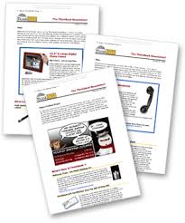
Newsletters are one of the most effective marketing and loyalty-building tools a business can use. We all know businesses that have produced their own in-house newsletters and have used them as powerful marketing resources for their company.

See full size image

Newsletters “connect” potential buyers to your business in a way that most conventional advertising never will. People love to read them! Providing your customers with a monthly newsletter is an easy to build loyalty, goodwill, and devotion to your company.

Here’s a list of three newsletter tips and ideas you might find helpful.

  1. Think about your content. Generally, the most popular newsletters don’t contain a lot of industry-specific, technical copy. This can seem boring and self-serving to your readers. It’s better to provide interesting articles that will appeal to most people. Use a strong nameplate masthead and a few display ads in your newsletter to “sell” your products or services.
  2. Newsletters increase customer loyalty, so your mailing list should include customers as well as prospects that you would like to develop into customers.
  3. Lastly, newsletters don’t have to be expensive. Paragon Press can offer several different printing options. You might start with a simple, inexpensive, one-color newsletter, and progress to two-color and full-color as your newsletter’s popularity increases.

Newsletters can help your business muscle through the mail stack with your company’s selling message. If you’d like the phone to ring more, we’ll help you make it happen with newsletters.

www.ParagonPress.net – #1 in Shreveport, LA for printing, direct mail, graphic design, marketing – 318.868.3351

Room to Breathe

One of the most common pitfalls in design occurs when text is squeezed into borders and boxes, or wrapped too tightly around illustrations or silhouetted photographs. Next time you are faced with the challenge of creating sufficient breathing room in your designs, remember: there is beauty in simplicity.
Compare the following examples of crowded vs. comfortable designs:
Here are some simple solutions on how to avoid the claustrophobic, unappealing feel of crowded design:
  • Increase the size of the border or box.
  • Increase the size of the margins on the edges of the page.
  • Add more breathing room around individual elements by increasing the white space in text wraps.
  • Decrease the font size, or cut back on text when possible.

http://www.ParagonPress.net – #1 in Shreveport, LA for printing, direct mail, graphic design, marketing services – 318.868.3351

Low Cost Clip Art & Image

Digital clip art collections provide a great source for designers to obtain inexpensive (sometimes even royalty-free) images. If you’re considering purchasing a digital clip art collection, here are some questions to ask:
  • Are the images in this collection compatible with my operating system and the software I use?
  • Is the file format (EPS, JPEG, TIFF, GIF, etc.) versatile enough for my needs?
  • Are the images of a high-enough resolution and quality?
  • Are the images bitmapped or vector-based? (Vector-based images are better if you’ll need to enlarge them.)
Other Sources to Check
As you search for images, don’t forget to check the Library of Congress web site. In addition to copyrighted images, their online catalog of prints and photographs even includes a number of quality images in the public domain, as well.
Old magazines and books are another potential source for images. Any that were published before 1923 are in the public domain. Those published between 1923 and 1963 might be in the public domain, unless the copyright holder renewed their claim. Anything published after 1963 is still under copyright, so you’ll need to obtain permission before using it.
And finally, our print shop has a number of print-quality clip art collections on file, too, which you are free to browse.

http://www.ParagonPress.net – #1 in Shreveport, LA for printing, direct mail, graphic design, marketing – 318.868.3351